Process
The exploration began with sketches of simple digital layouts, testing how three time zones might coexist on a single widget. Early iterations leaned on traditional watch layouts, but these quickly felt cluttered and unintuitive. I shifted my focus to a linear display of time, experimenting with typography and spacing to create a clear spatial relationship between home time and other time zones.
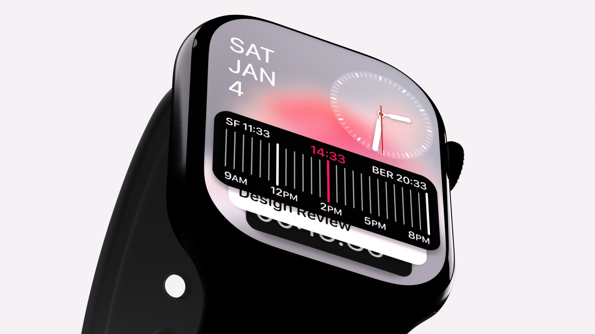
Midway, I brought my UI iterations into 3D to see how the widget would behave in the context of a smart watch. This surfaced legibility challenges with lighting and glare, which led me to refine the spacing and width of the UI elements for better readability.
The final iteration strikes a balance between clarity and utility, allowing up to three time zones to be viewed at a glance without clutter.