To get started, I collaborated with the customer support and data teams to identify the most critical user journeys, pain points, and feature requests. I also conducted qualitative research to understand the motivations and goals of Perlego's mobile app users.
Based on our initial findings, we discovered that the top user concerns were resuming their activity from the previous session on the web, discovering new content, organising and accessing their library, and consuming content. With this in mind, we prioritised the roadmap based on importance, impact, confidence, and effort, and set out to make iterative improvements every two weeks.
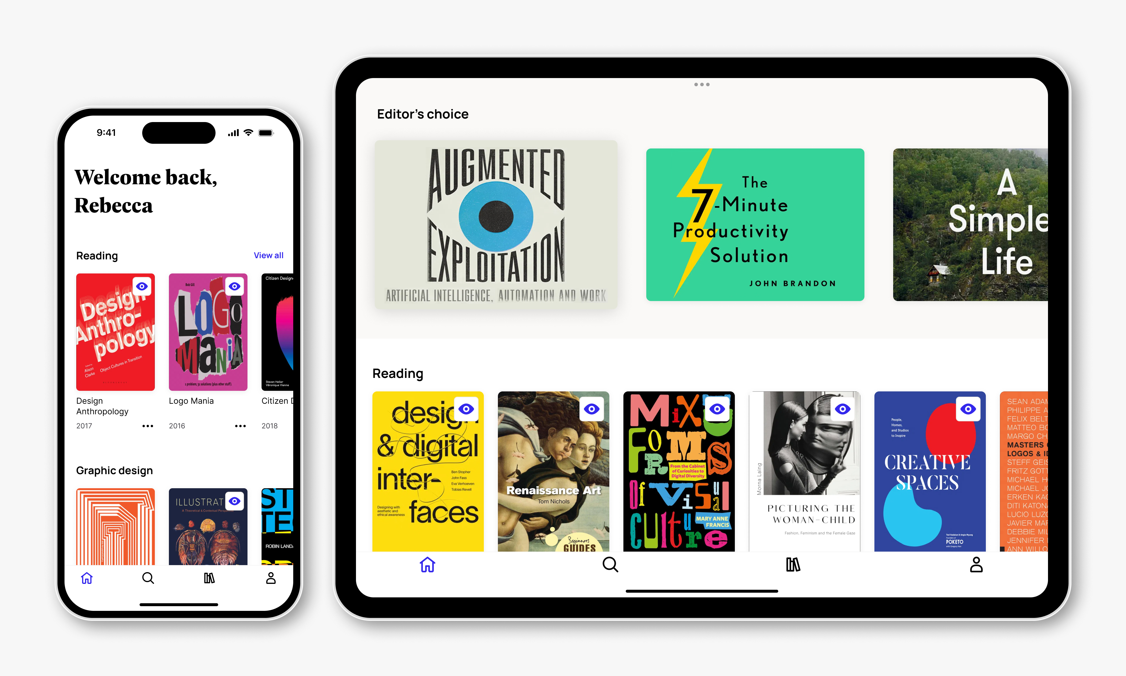
We first redesigned the app's home screen since it is the starting point for all subsequent actions on the app. After conducting qualitative research with app users, we’ve added a 'Reading' carousel at the top of the screen, making it easy for users to quickly access their recently opened books from the website. Additionally, we have added metadata, such as the book title and publishing year, on each book card to enhance the browsing experience and make it easier to differentiate between multiple books within the same topic.

To enhance the content discovery experience on our app, I analysed the search behaviour of our web app users and conducted a series of user interviews to gain insights on how they search for books on Perlego. Based on the findings, we have added popular search filters such as book language, publishing year, and book format to the search screen to help users in narrowing down their search results.
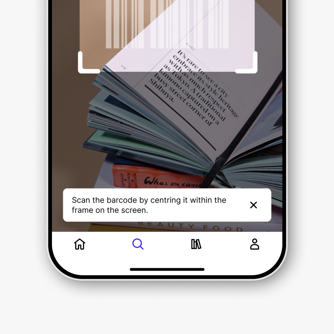
As many app users mentioned in user interviews that Perlego helps them avoid carrying too many physical books for their studies, we have also implemented an ISBN barcode scanner feature. This feature helps users search for the eBook version of the books they find in the university library or bookstores.
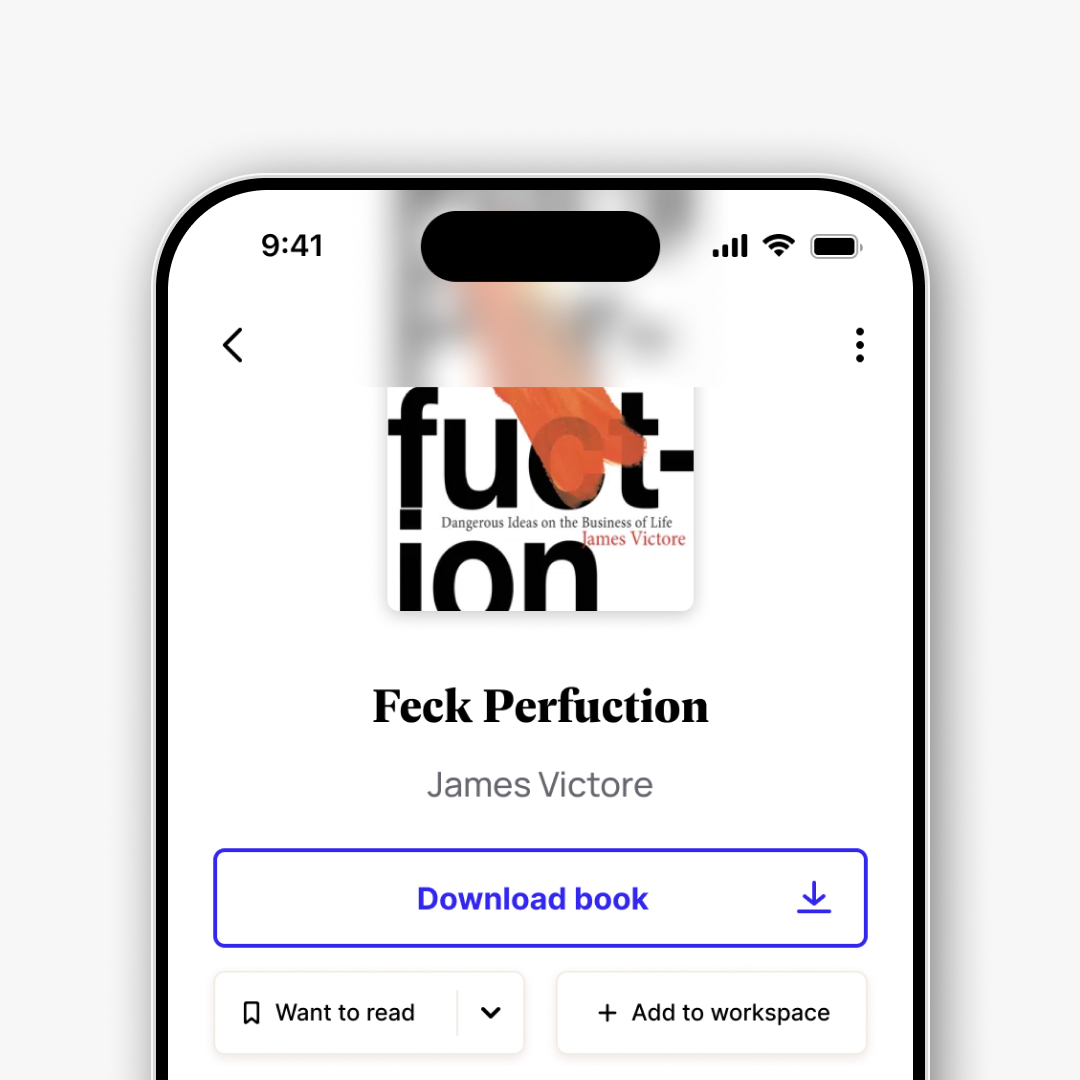
When I learned that the web teams had started revamping the reading list feature, I saw an opportunity to collaborate with them and address the much-complained-about library management on the app. We worked together to align the user experience with the website, making it easier for users to manage their virtual bookshelves from any device. We added new features that allow users to mark and filter books by status such as 'Reading', 'Want to read', and 'Completed' and add them to Workspaces.
During user interviews, downloading and accessing books offline was frequently mentioned as the app's standout feature. However, many users reported that the functionality was not working for them.
To investigate the issue, I collaborated with customer support and conducted a series of focus group interviews. Our findings revealed that users expected the app to finish the download in the background when switching to other apps, and they were missing visual feedback indicating whether the download had started or not.
To address these concerns, we took a split approach. The engineers completely rewrote the download queue to enable faster downloads, better app performance during ongoing downloads, and the ability to finish downloads while the app is not in the foreground. At the same time, I redesigned the downloading experience to make it easier for users to understand when downloads are in progress. We also added optional push notifications to alert users when the app finishes downloading their book in the background.
After overcoming the difficulties of helping users find and access their books, improving the reading experience became our main focus to meet their expectations.
In the beginning, the mobile app only supported a small number of books, as larger ones took too long to download, and PDF books could not be rendered. After we made changes to the download queue, we were able to unlock more books from the catalogue, but we still needed to develop a PDF reader within the app to make all one million plus books available.
I collaborated with internal stakeholders to prioritise the optimisation of the reading experience across all book formats available on the app before investing in any new reading features. The aim was to provide users with a seamless reading experience, regardless of the book format they choose, and to eliminate any confusion over the available features.
We first released a basic version of the PDF reader to unlock the entire content catalog, and then provided biweekly updates to build out a consistent reading experience across all books in the app.
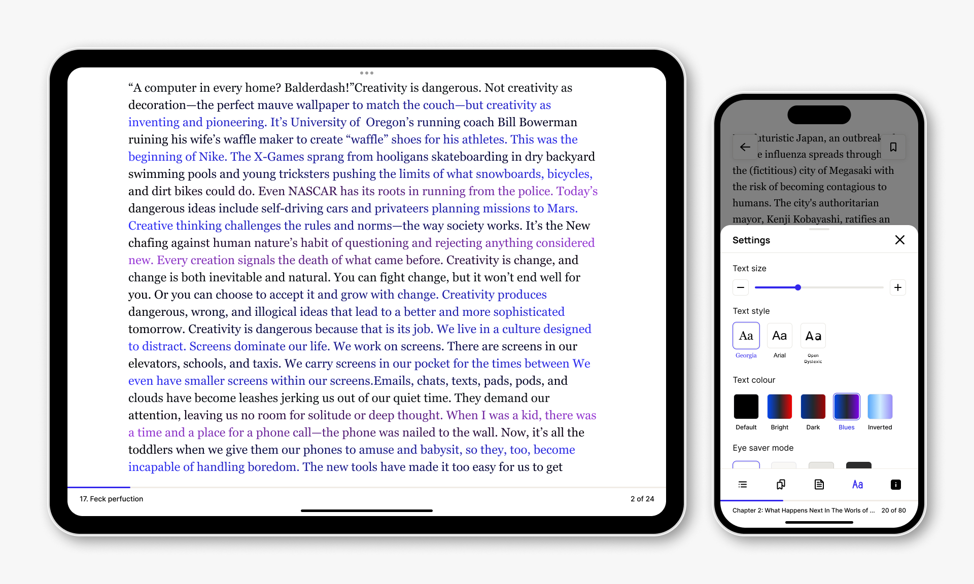
After unifying the reading experience, we improved the annotation experience, added pencil support for tablets, and conducted usability tests to perfect the highlighting and note-taking process on the app.
I designed several onboarding screens to progressively teach users how to use different touch gestures for various book formats. I used a mix of animated and still images to demonstrate tap and drag actions. To ensure the visuals were clear, I validated that users understood the meaning without needing to read the image description.

In early 2024, Perlego used the latest advancements in generative AI techniques to introduce text-to-speech functionality to the Perlego app. As part of this project, I conducted generative research to understand users' expectations when it comes to listening to books on the go, and designed a mobile listening experience that met their needs. Through our research, we discovered that users mainly wanted to be able to passively consume audio. Therefore, we prioritised background playback while the device was locked and made it easy for users to adjust the playback speed when returning to the app.

Improving the user journey experience, from content discovery, access, and library management to consumption, proved to be a successful endeavour as the ratings on both the App and Google Play Store improved significantly from 2.5 to 4.5 by the end of 2023.
This project was marked by several notable milestones, such as running the mobile squad as a product designer and product owner for the first 18 months (a first for me!), unlocking the entire Perlego catalogue on the app, and building out the entire app design system and component base.
I am proud of the team effort that went into the app, and I am glad that the Perlego app established itself as a viable subscription option among established market players.

